Mother & Son Bowling
OhG. CREATIVE THINKING MADE VISIBLE. We bring brands to the forefront with compelling content and solutions that impact with the perfect balance of form + function.
Christine Grieves, Ohgdesign, graphic design, branding, identity, cleveland, ohio
1052
portfolio_page-template-default,single,single-portfolio_page,postid-1052,bridge-core-3.1.3,qi-blocks-1.2.7,qodef-gutenberg--no-touch,qodef-qi--no-touch,qi-addons-for-elementor-1.7.0,qode-page-transition-enabled,ajax_fade,page_not_loaded,,qode-title-hidden,qode_grid_1200,side_area_uncovered_from_content,qode-theme-ver-30.4.2,qode-theme-bridge,disabled_footer_bottom,qode_header_in_grid,qode-portfolio-single-template-8,wpb-js-composer js-comp-ver-7.3,vc_responsive,elementor-default,elementor-kit-1658

Mother & Son Bowling

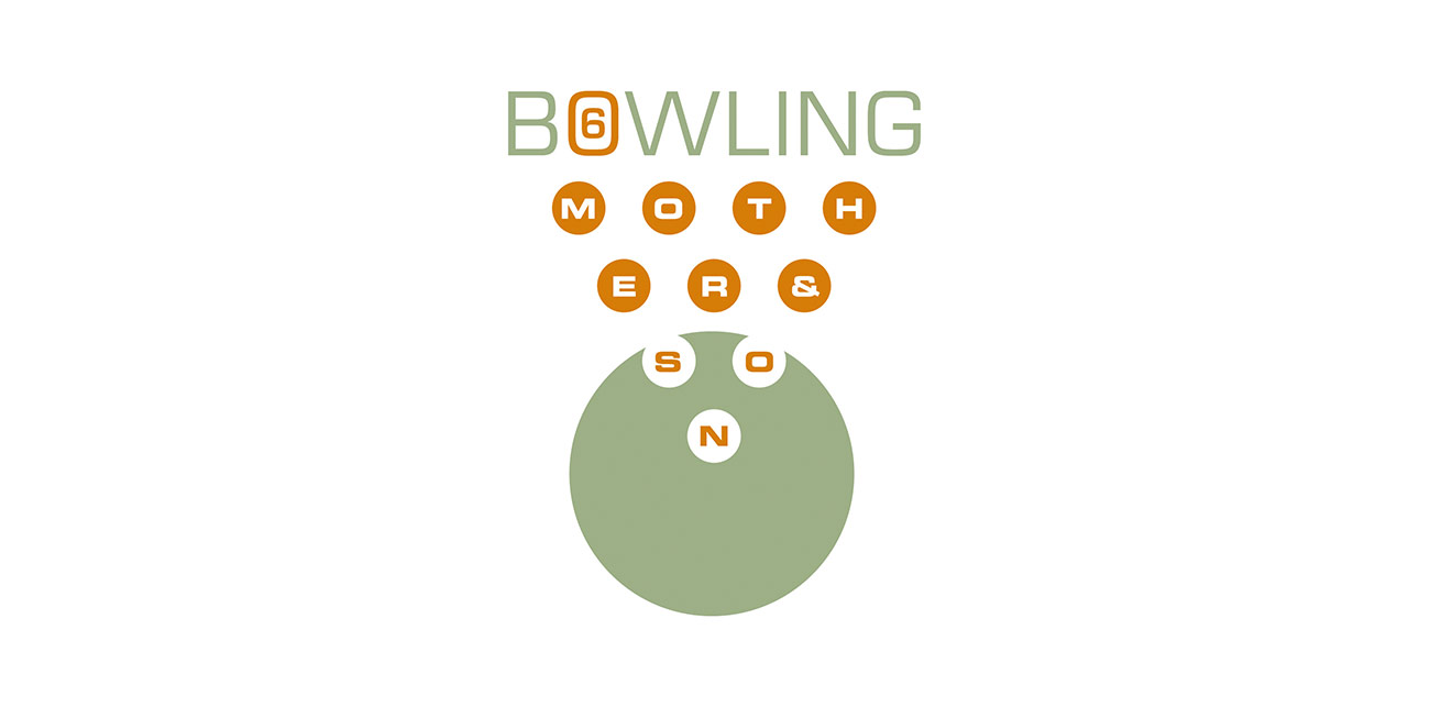
A logo was created for the annual Mother & Son Bowling event for the 4th grade boys at St. Gregory the Great Elementary School. To visually convey intermingling, the type is integrated within the ten pins and finger holes of the bowling ball, signifying social mingling of both mother and son in this recreational event. The color usage was chosen to reflect the 1950s era, which is known as the decade of the bowler.

Client

St. Gregory the Great Elementary School

Category
Brand + Identity